Some Things I've Designed
Over the last few years, I've designed a few things that I'd like to share. Some for clients, some for fun, and some to bring recycling to my community. I don't do a ton of designing, so when I do design something I like I feel like sharing.
Logos
I've designed two logos that I really like. The first is for The River Radius Podcast. A few years ago, my old landlord Sam asked if I'd help him design a logo for his new podcast about rivers. Even though I'd done very little logo design before I figured I could try. Sam already had a pencil drawn mockup which helped. I really like how it came out, and I'm really impressed with the podcast the logo represents, too. Sam tells important stories about rivers, the people who love them, the people that need them and the wildlife that depend on them.

The second logo I'd like to share is a logo that I made for my good friend and first client, Durango Shade Company. Before this design, I designed Durango Shade Company's first logo, which was ok but it was hard to tell what it was. It was just some blocks that were supposed to be windows. This new logo is simple — still just a few blocks — but clean and can be displayed at lots of different sizes. It isn't too complicated, but It looks nice.

Kind of #rtistry
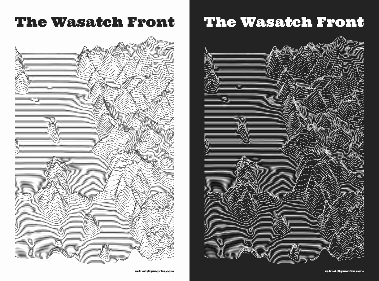
Now onto some R scripting, I designed this poster using Digital Elevation Models of where I grew up on the Wasatch front in Utah. For a while I was interested in making maps that artistically and programmatically showed where I have lived and live. Interestingly, by far the most interesting place that I've lived for this project was Salt Lake City, Utah. Particularly for this piece which shows how drastic the Wasatch are.

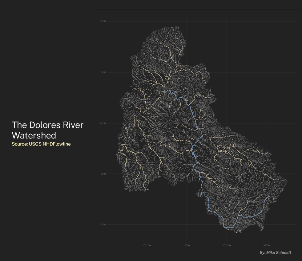
Continuing with the theme of where I live, I made a map of the Dolores River and all of its Tributaries. I live about 2 miles from the Dolores River. It provides amazing recreational opportunities in the small town that I live. But it also a wild place that is hard to get to in many places. Large stretches of it are roadless. A few years back a buddy and I did a 9 day raft trip down the Dolores from Big Gypsum Valley to the confluence of the Colorado River. It was one of the best trips of my life.
In this map the Dolores is in Blue. Larger tributaries are in orange and smaller ones fade to grey. In hindsight I would choose a different font and add a key but alas here it is in it's original form.

Recycling
And lastly, maybe the thing that I am most proud of is the signs I designed for the recycling non-profit that I was on the board of for several years. These have zero flash but serve a purpose, get their point across and are easy to read. I walk by them all the time and am proud to have made them because they help people recycle and decrease the likelihood that people will put the wrong thing in bins which turns recycling into trash.

I don't have a ton of time to design but I like when I do. I hope to do it more in the future.